
Call-to-Action Design That Increases Website Conversions – Navyug InfoTech
You can have great design, great content, and solid traffic, and still lose the sale at the last step.
By Navyug InfoTech, Ahmedabad
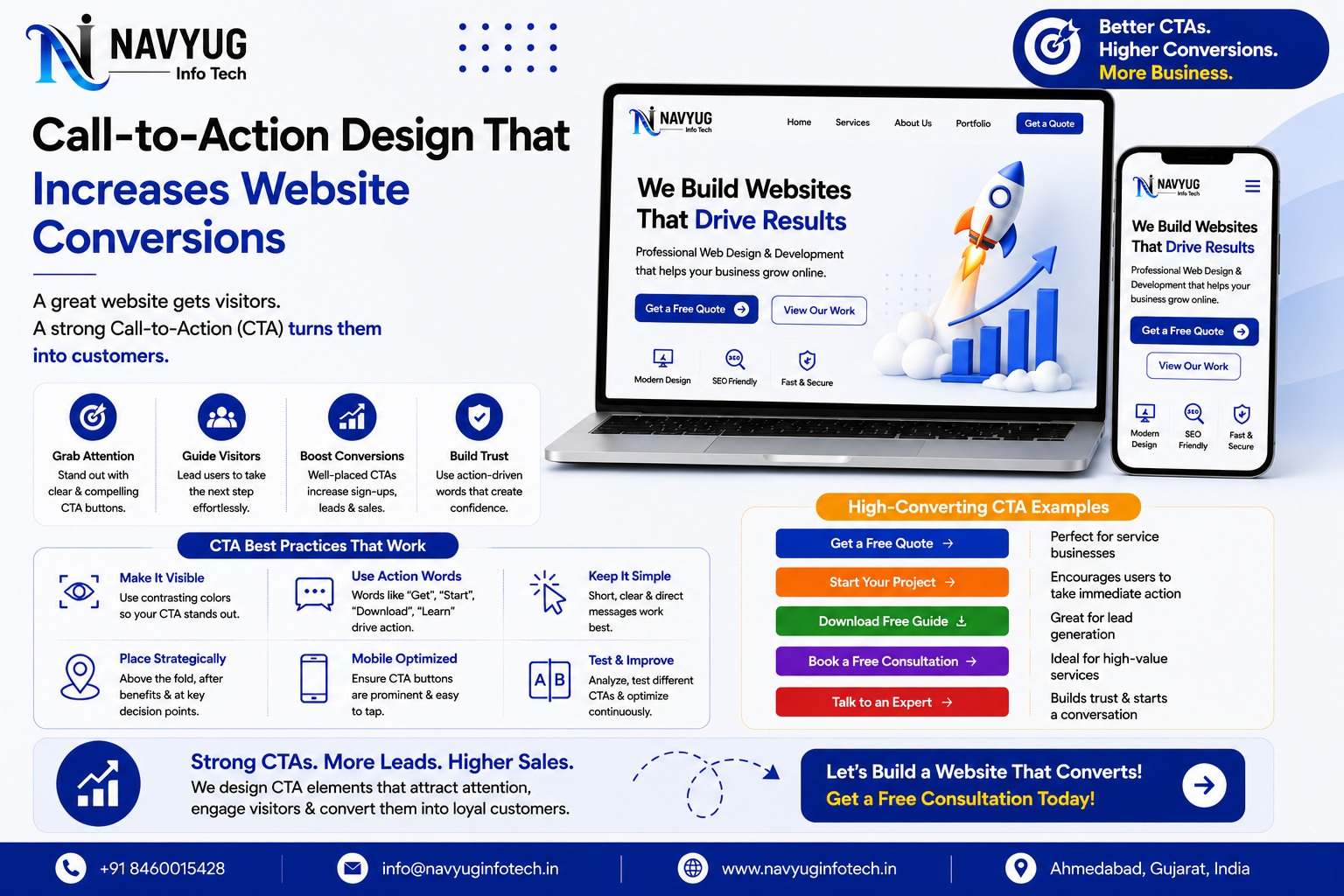
You can have great design, great content, and solid traffic, and still lose the sale at the last step. Strong call-to-action design is what actually pushes a visitor to click, call, or fill out a form instead of quietly leaving your site.
At Navyug InfoTech, call-to-action design is treated as a core part of every website we build, not a small detail added at the end.
Here’s what makes a CTA actually work.
Why CTAs Matter More Than Businesses Realize
- Guides visitors toward the exact action you want them to take
- Removes ambiguity about what to do next on a page
- Directly impacts lead generation and sales conversion rates
- Small wording and design changes can meaningfully shift results
- A missing or weak CTA can waste otherwise strong traffic
Principles of Effective CTA Design
Use Action-Oriented Language
Words like “Get,” “Start,” “Book,” or “Claim” prompt action more effectively than passive phrases like “Submit” or “Click Here.”
Make It Visually Stand Out
Use a contrasting color and enough white space around the button so it’s impossible to miss, without clashing with your overall design.
Keep the Message Specific
“Get a Free Quote” tells visitors exactly what happens next, while a vague “Learn More” leaves them uncertain about the outcome.
Place CTAs Where Decisions Happen
Add CTAs after key information sections, not just at the very top or bottom of a page, so visitors can act right when they’re convinced.
Limit Competing CTAs on One Page
Too many competing calls-to-action create decision fatigue. One primary CTA per page keeps the visitor’s focus clear.
Reduce Friction Around the CTA
Keep forms short, avoid unnecessary steps, and reassure visitors with trust signals like “No spam” or “Response within 24 hours” near the action.
Common CTA Mistakes
- Generic text like “Submit” or “Click Here” with no context
- Buttons that blend into the rest of the page design
- Multiple competing CTAs confusing the visitor
- CTAs buried below the fold with no earlier prompt
- Long forms attached to a CTA that should be quick and simple
Our Conversion Design Services
Navyug InfoTech designs websites with conversion in mind, treating CTAs as a deliberate part of layout and content strategy.
- Conversion-Focused Website Design
- CTA Copywriting & Placement Strategy
- Landing Page Design & Optimization
- A/B Testing for CTA Performance
- Ongoing Conversion Rate Optimization
Why Choose Navyug InfoTech?
- 10+ Years of Web Design & Conversion Experience
- Design Decisions Backed by Conversion Principles
- Content and Design Aligned Around Action
- Data-Informed Testing and Improvements
- Ongoing Support & Optimization
Frequently Asked Questions
How many CTAs should a single page have?
Generally one primary CTA repeated at key points on the page works best, avoiding multiple different actions competing for attention.
Does CTA button color really make a difference?
Contrast matters more than a specific color. A button that stands out clearly from its background will outperform one that blends in.
Should every page have the same CTA?
Not necessarily. The CTA should match the visitor’s intent on that specific page, whether that’s requesting a quote, booking a call, or making a purchase.
Getting Traffic But Not Enough Leads?
Let Navyug InfoTech redesign your CTAs to turn more visitors into customers.
Get Free Consultation
Ready for a website that feels like the future?
Tell us about your business. We will reply with a clear plan, timeline and quote.